FIGURATIVE ABSTRACTION BY

WHERE LIFE EMERGES FROM LAYERS OF COLOR
The Collection
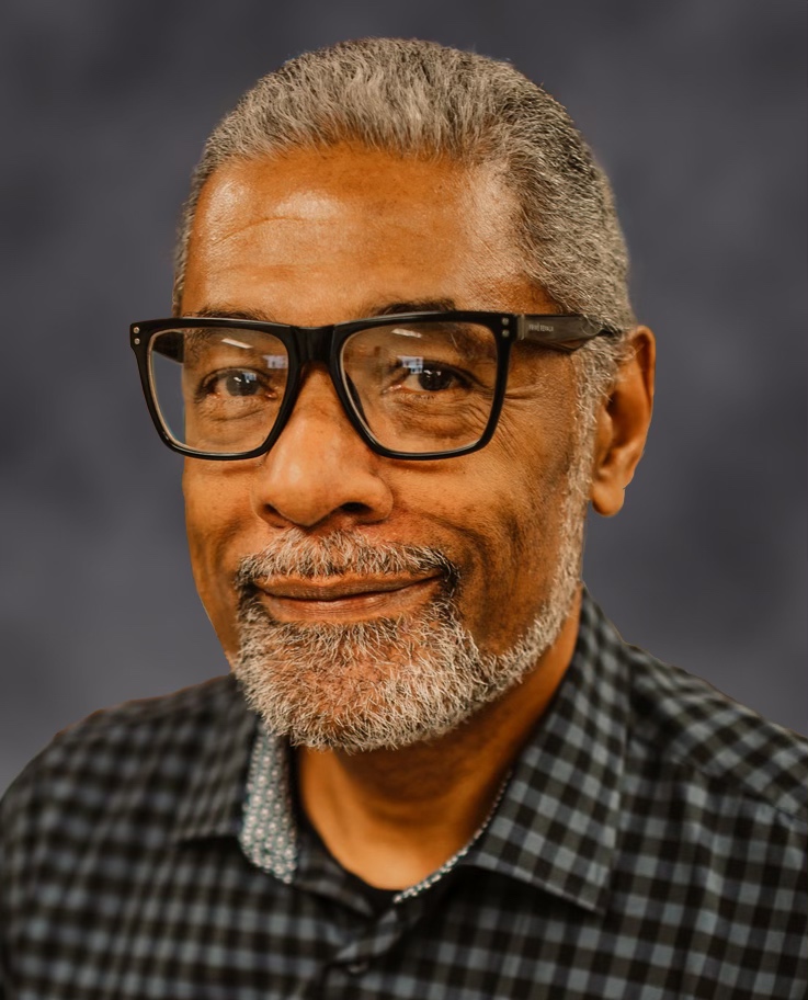
The artist
Biography
Jerome Tarpley is a painter, illustrator, and graphic designer whose work brings the human figure into vivid fields of overlapping color. He began drawing as a child, exploring abstraction and finding inspiration in Picasso and Gustav Klimt. Encouraged by a teacher and mentor, he pursued art professionally, graduating in 1974 from the Ringling School of Art, now Ringling College of Art and Design, in Sarasota, Florida.
After moving to Atlanta, Tarpley worked as an illustrator at The Art Studio and created retail graphics with Miller Zell Design Studio. His independent design practice served clients including Coca-Cola, MARTA, the Arthritis Foundation, and Prevent Child Abuse Georgia. His commercial work earned recognition including a CEBA Award for Coca-Cola and Calendar Marketing Association awards for Pepsi.
A lifelong interest in fine art led him toward a more abstract practice in oils on canvas. Through vibrant color and layered shapes, he seeks to convey emotion, movement, and the energy beneath an image, inviting viewers to connect with the life within his paintings.
I want the people in my paintings to feel alive.
I’ve always loved drawing, and people keep giving me reasons to paint. A smile, a musician absorbed in a song, the way a dancer holds herself — those are the things that catch my attention. I want the people in my paintings to feel alive. I’m interested in their expressions, their movement, and the feeling of being there with them.
Color gives me room to follow my imagination. I can let a blue run through a face or carry a shape from someone’s clothing into the space around them. The person is still there, but I’m free to see them in another way. That freedom is what keeps painting interesting for me. I hope someone looking at the work finds something familiar in it, then notices something they didn’t expect.
Color gives me room to follow my imagination.
Process
I work in oils on canvas, building the image with overlapping shapes and color. I pay attention to a face or a gesture, then to what’s happening around it. Sometimes a color needs more room; sometimes an edge needs to be quieter. I step back to see how the whole painting feels, then move in close again. I want the figure to come through without losing the loose, unexpected things that make the painting interesting.
Process: how a figure emerges
PRIVATE VIEWING
For acquisition inquiries, availability, additional photography, or private viewing information, please contact the studio.
Thank you for your inquiry.
Your inquiry has been received. The studio has your contact details and message.